Mouldbreaker Interactive
Mouldbreaker Interactive was founded on the idea that “protecting your team” — and not personal gain — should be studio leadership’s first priority. I was brought in to help them create their brand identity, Starting with their new company logo.
I took inspiration from the company’s mission statement, aiming to combine the elements of “Protecting the spark” and “Breaking the mould” in a single, easy to recognise form. We ended up with this form that represents both a large front facing shield with the spark it protects being held in its centre; while also represting a mould from 3/4 perspective being broken through by the spark from within.
The RPG Action Map
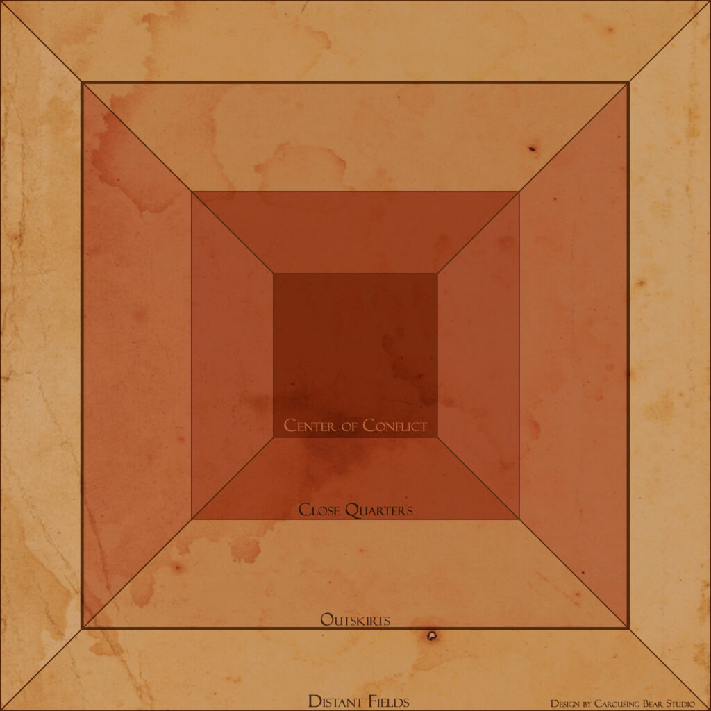
The Action Map is a tool to clarify relative (fictional) positioning for generally smaller encounters. Breaking out an entire battle map for a simple random encounter can take more effort to set up than to play out, so this is a perfect moment to use the Action Map! Save that effort for the important boss battles and campaign altering encounters!
Tweakers Huisfeestje 21 event
I got tasked to design the full branding for Tweakers yearly anniversary event as my application project. This included advertisement banners for different for formats, a large cover banner for their article, printables like key cords and nameplates and more.
I decided to play into Tweakers’ casual aesthetic and the event’s focus on games and celebration to create a catchy and cheerful art style. All the icons were custom designed and the colour palette was chosen to pop out at users without overwhelming them. Sadly the designs were never used in the end due to the covid 19 pandemic.
Badges, Banners and Brands
A collection of badges, banners and more that I’ve crafted over the years.