Mouldbreaker Interactive

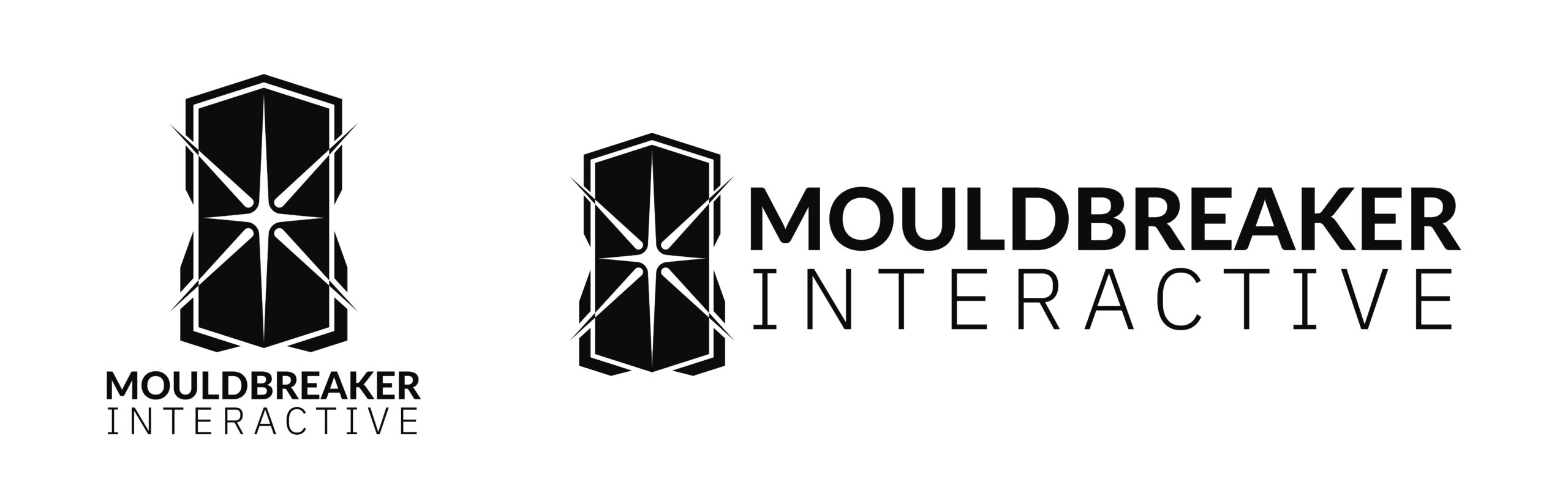
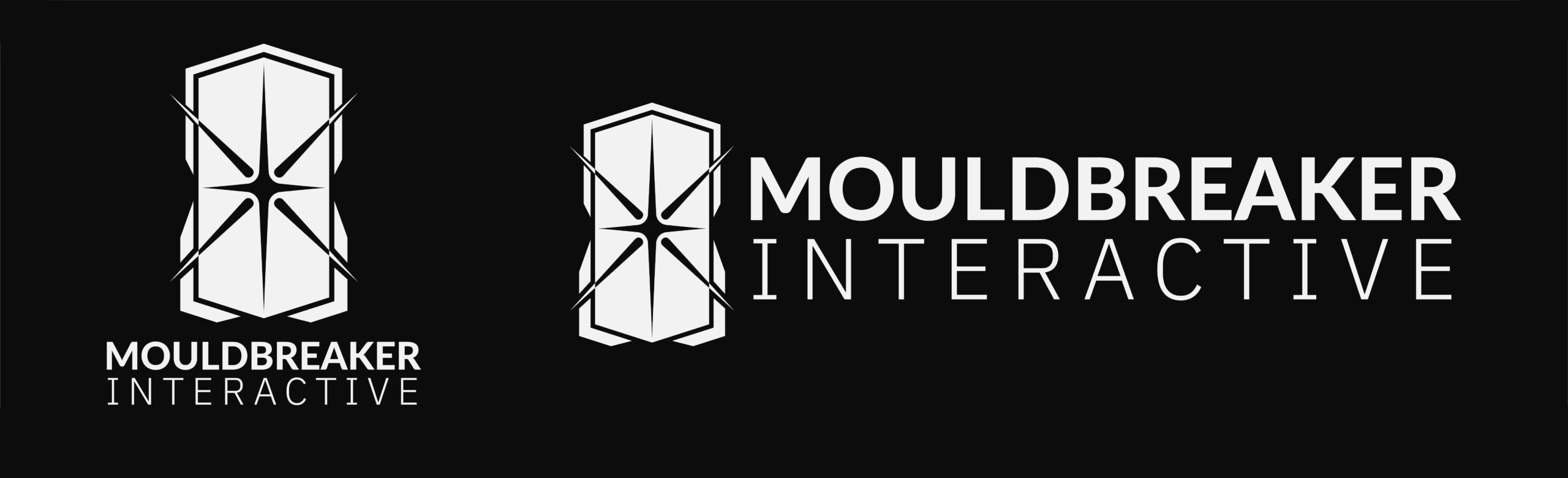
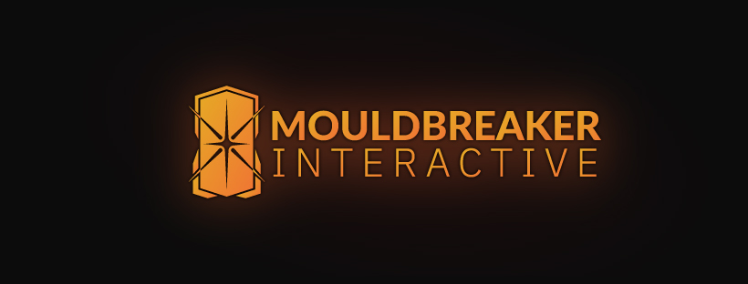
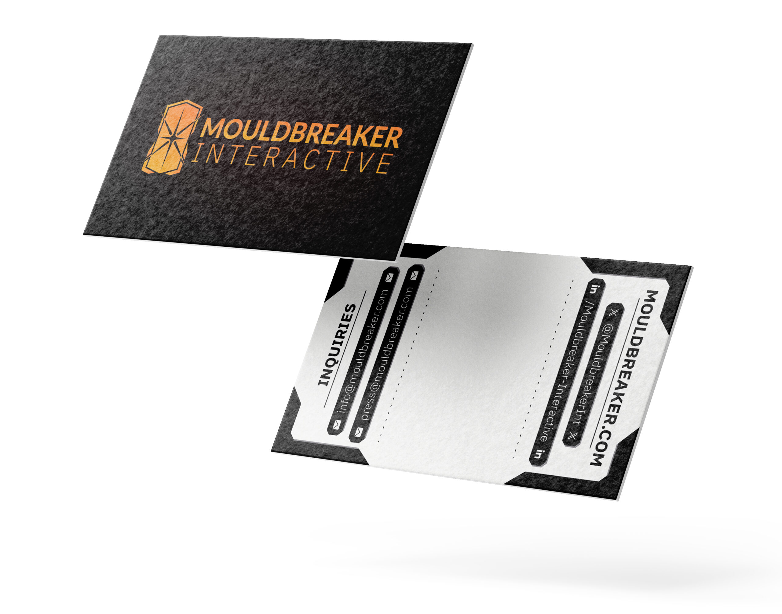
Mouldbreaker Interactive was founded on the idea that “protecting your team” — and not personal gain — should be studio leadership’s first priority. I was brought in to help them create their brand identity, Starting with their new company logo. I took inspiration from the company's mission statement, aiming to combine the elements of "Protecting the spark" and "Breaking the mould" in a single, easy to recognise form. We ended up with this form that represents both a large front facing shield with the spark it protects being held in its centre; while also represting a mould from 3/4 perspective being broken through by the spark from within.
Showcasing the logo for the company Mouldbreaker Interactive. The logo consists of an elongated hexagonal shape that represents both a large mould in 3/4 perspective and a large towershield from the front perspective. A star like shape extrudes in eight directions from the centre. The horizontal and hexagonal extrustion are contained within the hexagonal shape while the diagonal extrutions break through it. This star respresents the spark of creativity that the company wishes to protect, while it also "breaks the mould" of expectations withint the industry. The logo has an golden orange-like colour with a faint red glow to resemble the colour of molten steel pouring out of a crucible into the mould.
Mouldbreaker Interactive Profile Image
;